Overhauling Activity Management
for School-Age kids with New Web Interface
Activibee Web, UX Design Case Study

The product
ACTIVIBEE Website is a companion to mobile app, that targets specifically to parents seeking efficient afterschool activity management for their children.
Following project is a second Case study within the Google UX Certificate program. Theme was provided by Google as part of the course.
Project Duration: Q2 2024
Project overview
-
Booking activities in Slovakia is done by email or in person, often lacking any form or management
The Problem
-
Extend app flow to web page covering a simple booking process
The goal
-
As a beginner UX designer at a time, my role was to follow course instructions and adopt best practices for the field.
My role
-
Solving UX for project prompt "Design an app and responsive website that parents use to enroll their kids in after-school care and pay for the service"
Responsiilities
The Solution
Homepage
Homepage introduces three separate rows that allows the user look for activity via form, hobby filter or suggestions based on community recommendations.
Simple animations enhance clear feel of the website, making it easier to glance through.
Booking Flow
Adapting the booking flow to the bigger screen created a challenge in a way that reusing components designed specifically for the app in most cases didn´t work properly.
User research
-
For this project, I was provided with a data sheet that includes bio of potential users. By analyzing the data I've spotted common themes, user pain points and created user personas representing the summary information available.
This is a second Case study for project prompt mentioned above. All research discoveries correspond with Case study for Activibee App.
*If you would like to dive deeper, please refer to provided link.
Pain points
-
Less time for tasks
Planning should not take long time, because usual schedule of the users gets overwhelming easily.
-
Budgeting
Affodrability of the service plays a key part in decision process.
-
Unstable schedule
With a lot of tasks to tackle + work settings and possibility of single parenting can schedule become unpredictable.
-
Disorganization
Connected to pain point nr. 3. there is a possibility of a snowball effect that leads to disorganization.
Putting Pen to Paper
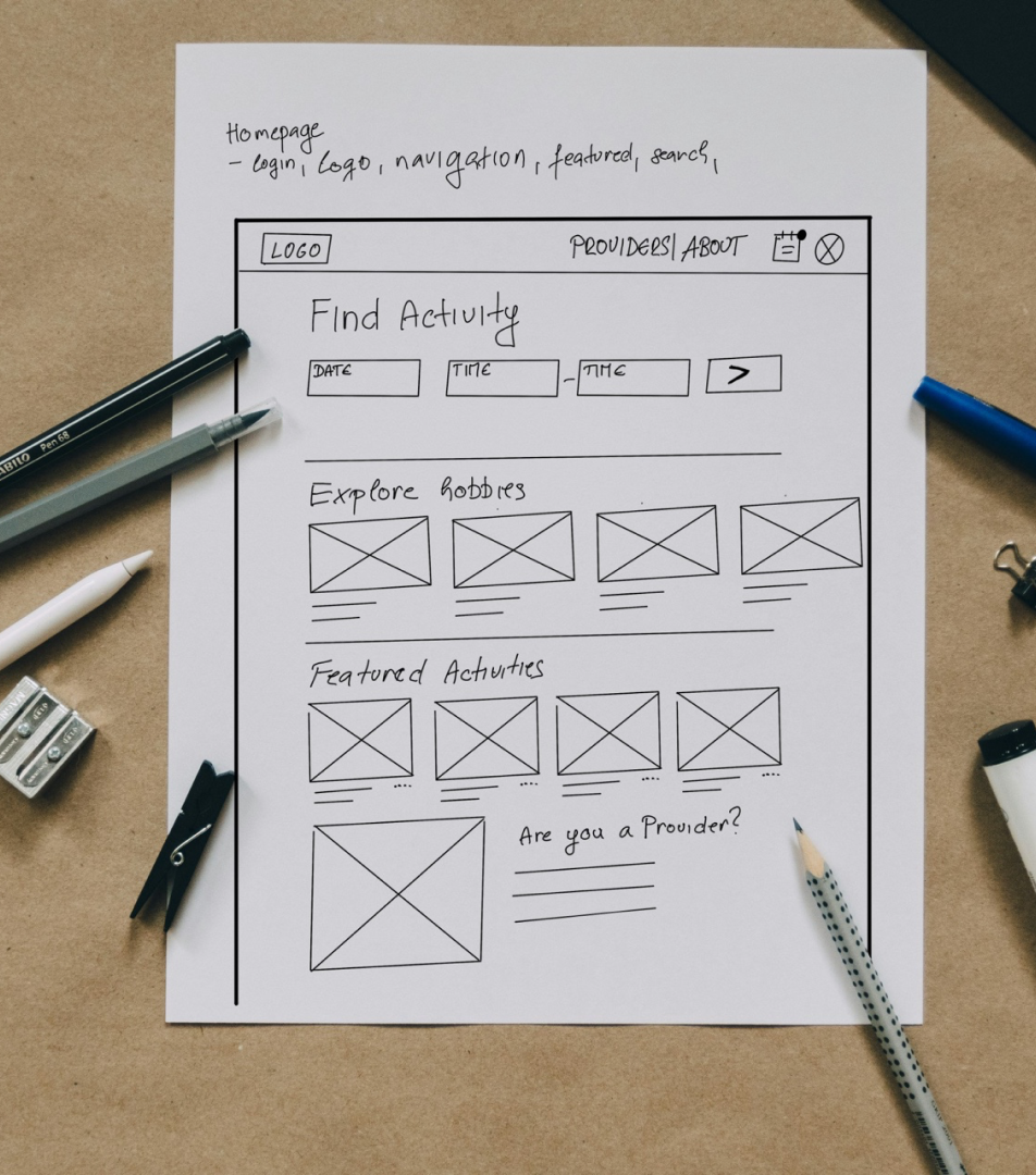
Wireframing was done utilizing the top-down method. Using known elements from the app such as hobby cards, reimagining the design for website was kept simple, yet familiar.


Transfering to digital
Homepage
My goal was to make the design as simple as possible to actually let user decide his own way to finding activities.
Homepage introduces three separate rows that allows the user look for activity via form, hobby filter or suggestions based on community recommendations.
Bookings page
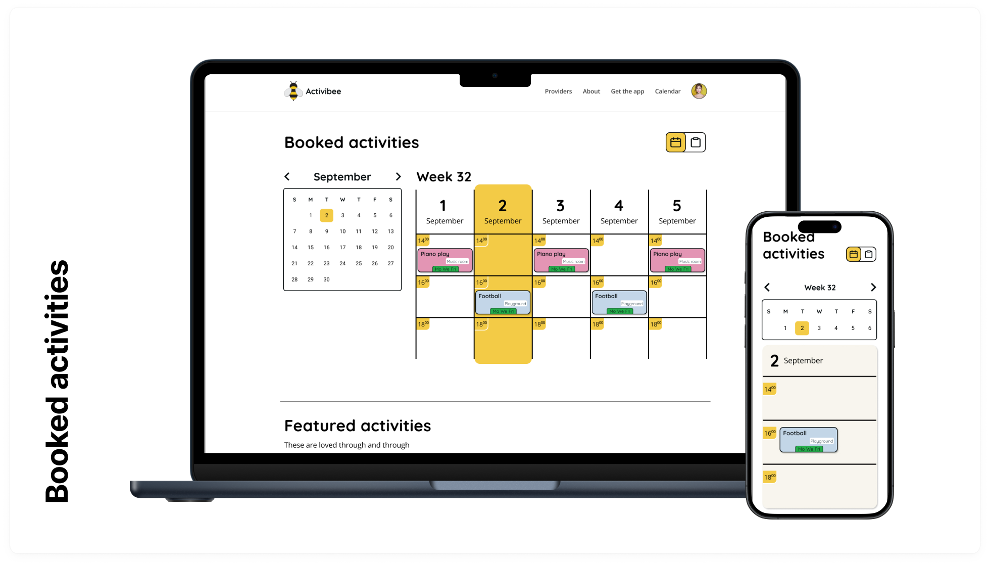
Booked activities page contains calendar with booked activities and a toggle between calendar and card view.
This way the user can reffer to booked activities the way he preffers.
Early prototype
You can interact with the prototype right here, or open in new tab.
Mockups
-
Evolving the design with simplicity in mind. For the typography I’ve decided to keep the previously used Quicksand font family for Titles, for body text however I picked font Open Sans for it’s great legibility and versatility.


High-Fidelity prototype
You can interact with the prototype right here, or open in new tab.
Key takeaways
-
My Focus
In this part of project I’ve decided to focus on learning how to create smooth flow on pages and how to create animations in Figma without over-complicating the design.
-
Lessons from the project
Designing the website using top-down method made the process harder from responsive point of view.
For my next projects I´ll do my best to utilize bottom-up method where suitable.
One (or) more thing(s)
-
Study Slide Deck
This Case study is available as a Slide deck in link here.
-
Original Figma file
Have alook at my design process, view the file here.
-
Let´s connect
If you´d like to reach out and say Hi or grab a coffee, you can do so by writing an email:
say@hellluke.tech
Thank you
-
I truly appreciate the time you invested into viewing this case study.


